Your wedding invitation is often the first glimpse your guests get of the celebration you’re planning. Before they see the venue, flowers, dress, or tablescape, the invitation can already give them a sense of the mood and style of your big day. Whether you’re planning an elegant ballroom wedding, a relaxed garden celebration, or a modern minimalist event, choosing the right invitation can help everything feel beautifully connected.
The good news is that you don’t need an overly complicated design to make a strong impression. By thinking about your wedding colors, venue, formality, typography, and personal style, you can find invitation cards that feel intentional from the very beginning.
If you want your invitations to feel personal and different, these unique wedding invitation cards offer plenty of creative inspiration.
Start With Your Overall Wedding Style
Before choosing an invitation, think about the atmosphere you want your wedding to have. Your invitation should feel like a small preview of that experience rather than a completely separate design.
If you’re planning a classic and formal wedding, traditional layouts, elegant typography, ivory paper, and subtle details can work beautifully. A romantic celebration may suit soft colors, delicate floral illustrations, and graceful script fonts. For a modern wedding, clean lines, simple typography, and minimal decoration can create a polished appearance.
Think about three or four words that describe your wedding. Words such as elegant, romantic, modern, rustic, playful, or timeless can help narrow down your choices.
Match the Invitation to Your Wedding Colors
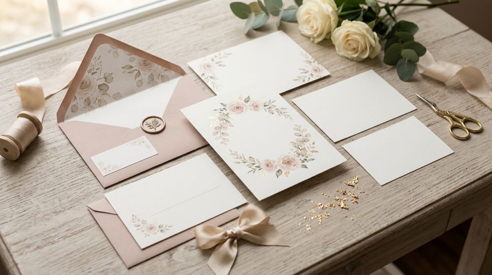
Your color palette is one of the easiest ways to connect your invitations with the rest of your wedding. Look at the colors you’re already considering for your flowers, bridesmaid dresses, table settings, or decorations.
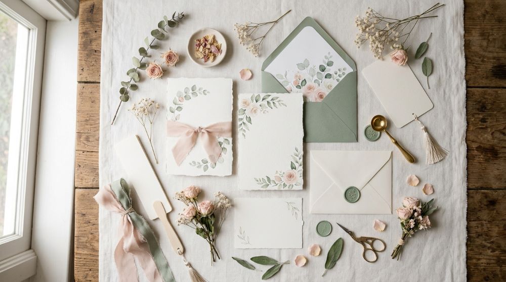
For a soft romantic wedding, blush, cream, dusty rose, sage, or champagne can create a delicate appearance. Deeper shades such as burgundy, emerald, navy, or plum can give a more dramatic celebration an elegant feel. If you’re planning a bright and cheerful wedding, you can incorporate warmer or more colorful tones into the stationery.
You don’t have to use every wedding color on the invitation. Choosing one main color with one or two complementary shades can often look more sophisticated.
[Image Prompt] A realistic flat-lay of elegant wedding invitation cards in soft ivory, blush and sage tones, delicate floral details, matching envelopes, silk ribbon, dried flowers and subtle wedding stationery accessories arranged on a refined table, soft natural window light, high-end editorial photography, no text or words on the cards.
Consider the Venue
Your wedding venue can provide useful inspiration when choosing your invitations. The invitation doesn’t have to match the venue exactly, but it should feel compatible with the setting.
A grand historic venue might pair beautifully with formal stationery, classic borders, elegant lettering, and traditional paper. A garden wedding could feature botanical illustrations, soft colors, or organic textures. A beach celebration may suit lighter colors, airy layouts, and subtle coastal details.
Think about what your guests will see when they arrive at the venue. Your invitation can create a visual connection between that first impression and the actual celebration.
Once you’ve chosen your invitation style, learn how to choose wedding card frames that enhance the design and give it a polished finish.
Choose the Right Paper Style
Paper can have a surprisingly large effect on how an invitation looks and feels. A thick, high-quality cardstock can immediately make a simple design feel more luxurious, while textured paper can add warmth and personality.
For a classic look, smooth ivory or white cardstock is an easy choice. Handmade or lightly textured paper can work beautifully for romantic or rustic celebrations. Modern couples may prefer clean, smooth paper with a minimalist finish.
When choosing paper, consider how your design will appear when printed. Some colors and fine details may look different on screen compared with the finished card, so ordering a sample can be helpful before committing to a large quantity.
Pick Typography That Fits the Mood

Typography can completely change the personality of an invitation. Elegant script fonts can create a romantic appearance, while serif fonts often feel timeless and sophisticated. Clean sans-serif fonts are particularly useful for modern and minimalist designs.
You can combine two complementary fonts to create hierarchy, using one style for the names and another for the important details. However, avoid using too many different fonts because the invitation can quickly become difficult to read.
The most beautiful invitation is still practical. Make sure names, dates, times, and venue information are easy for guests to find.
Think About Decorative Details
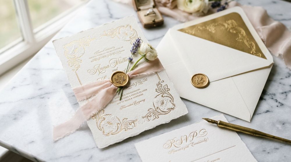
Small decorative elements can make your invitation feel more distinctive. Depending on your wedding style, you might consider floral illustrations, delicate borders, embossed details, wax seals, ribbons, vellum overlays, or simple geometric accents.
For a luxurious look, subtle metallic details can add sophistication without overwhelming the design. For a more relaxed wedding, hand-drawn illustrations or natural textures may feel more appropriate.
The key is balance. If your invitation already has an intricate floral design, you may not need several additional decorative elements. A few carefully selected details can make the design feel much more polished.
[Image Prompt] A realistic close-up of sophisticated wedding invitation stationery featuring thick textured ivory cardstock, elegant typography, delicate embossed floral details, matching envelope, thin silk ribbon and subtle decorative accents, arranged on a marble surface with soft romantic lighting, luxury editorial photography, no readable text or words.
Decide How Formal You Want to Be
The wording and appearance of your invitation can also communicate how formal your wedding will be. A black-tie celebration may call for traditional and refined stationery, while a casual outdoor wedding can use a more relaxed design.
Think about the experience you want your guests to have. If the invitation feels very formal but your wedding is a casual backyard celebration, the two may feel disconnected. Likewise, a playful invitation may not fully represent a sophisticated evening event.
Your invitation should give guests a realistic expectation of what to wear and what kind of atmosphere to expect.
Looking for more beautiful designs to inspire your choice? These stunning wedding invitations can help you create the perfect first impression.
Personalize the Design
While inspiration can help you discover what you like, your invitation should ultimately feel connected to you and your partner. Consider adding a meaningful illustration, a custom monogram, a venue sketch, or a small symbol that represents your relationship.
You might include a floral element inspired by your bouquet, an illustration of your venue, or colors connected to a meaningful place. Even a very small personalized detail can make a standard invitation feel much more special.
Don’t feel like you have to follow every traditional wedding stationery rule. If a clean modern card feels more like you than an ornate design, choose the style that feels natural.
Check the Invitation as a Complete Set
Remember that your invitation isn’t just the main card. The envelope, RSVP card, details card, envelope liner, and other pieces should work together visually.
You don’t need every piece to look identical. Instead, repeat a few elements such as the same color palette, typography, floral motif, or paper texture. This creates a coordinated stationery suite without making everything look repetitive.
Before ordering, carefully check every piece for spelling, dates, addresses, and other important information. A beautiful invitation still needs to provide clear and accurate details.
[Image Prompt] A realistic complete wedding invitation suite arranged beautifully on a light neutral table, invitation card, RSVP card, details card, matching envelopes, delicate floral accents, silk ribbon and coordinated stationery pieces, cohesive elegant color palette, soft daylight, high-end wedding editorial photography, no readable text or words.
Order Samples Before Making a Final Choice
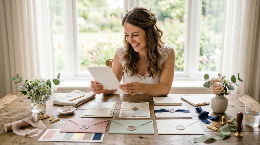
If you’re unsure between several designs, ordering samples can make the decision much easier. A design that looks perfect on a computer screen may feel different when you see the actual paper, colors, printing, and envelope together.
Hold the samples in natural light and compare them with your wedding color palette. Look at the paper quality and make sure the text is easy to read. This small step can help prevent expensive mistakes later.
It’s also a good opportunity to check whether the invitation feels like the wedding you’re actually planning. If it looks beautiful but doesn’t feel like your celebration, keep searching.
Final Thoughts
Choosing wedding invitation cards becomes much easier when you start with the overall feeling you want your wedding to create. Consider your venue, colors, level of formality, paper, typography, and personal details, then bring those elements together in a design that feels natural.
Your invitation doesn’t need to be extravagant to make an impression. Sometimes a simple layout, beautiful paper, thoughtful colors, and one meaningful detail are all you need to create stationery that feels elegant and personal.
Save this guide for later and use it when you’re choosing the perfect wedding invitations for your big day!
Carry the same style throughout your celebration with these wedding signs, stationery & details for thoughtful finishing touches.

Emma is the author and creative voice behind TheFashionary, sharing inspiring ideas on bridal fashion, wedding dresses, hairstyles, and timeless style. She loves discovering beautiful fashion trends and helping readers find inspiration for their special moments.