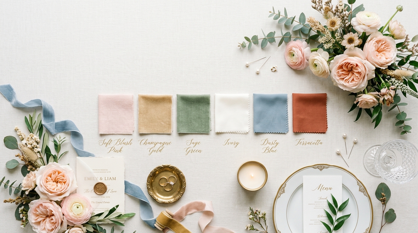
18 Elegant Wedding Color Palettes for a Perfect Celebration
Your wedding color palette touches everything. It lives in your florals, your stationery, your bridesmaids’ dresses, your table linen, your candles, and your cake. Getting it right means every element of your day pulls in the same direction and the photographs look cohesive rather than accidental. A color palette is not just about what shades you like. It is about how colors interact with each other, how they read in different lighting conditions, and how they translate across different materials and textures.
This guide covers 18 distinct palettes from moody and dramatic to soft and ethereal, from classic and timeless to fresh and contemporary. For each one, you will find guidance on florals, linens, stationery, and bridesmaids’ styling. Whether you are drawn to deep jewel tones or barely-there neutrals, there is a palette here that works for your venue, your season, and the atmosphere you want to create.
Sage Green and Ivory
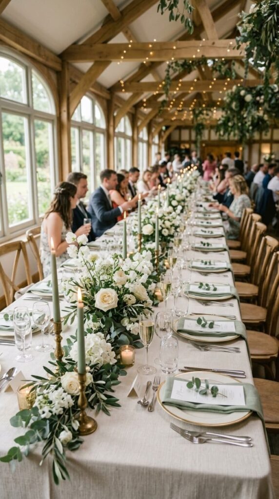
Sage green and ivory is one of the most enduringly popular wedding colour combinations for good reason. It works across every season, every venue type, and every formality level. It reads as both modern and timeless, which is a difficult balance to strike.
The palette works because sage is a green that leans toward grey. It does not compete or shout — it recedes quietly and lets ivory and cream take the foreground. This means you can layer multiple shades within the palette without things feeling busy.
For florals, think ivory garden roses, white sweet peas, ranunculus, and soft greenery like eucalyptus, ferns, and trailing ivy. All of these are widely available from wholesale flower markets and are among the most budget-friendly choices.
Budget tip: Sage green dried pampas grass and dried greenery is available in bulk at very low cost and can be mixed with fresh white blooms to reduce the overall spend on florals by 30–40%.
For stationery, choose a sage green ink on thick ivory card for invitations and menu cards. The combination looks handsome and professional when printed on a good textured stock. Bridesmaids in sage green dresses against ivory florals photograph beautifully in almost any lighting condition.
Dusty Rose and Champagne
Dusty rose is different from bright pink or hot pink. It is a faded, muted version of pink that reads as elegant and mature rather than girly. Paired with champagne which is a warm, golden cream rather than pure white — the result is a palette that feels sophisticated and deeply romantic.
This palette suits spring and autumn weddings particularly well. In spring it echoes the soft bloom of cherry blossom. In autumn it complements warm, golden venue lighting naturally.
For florals, choose garden roses in David Austin varieties like Juliet, Patience, or Keira — they come in perfect dusty rose shades. Add dried pampas grass in blush or bleached tones, and use dried bunny tail grass for additional texture.
Budget tip: Champagne satin or velvet tablecloths can be hired rather than bought. Hiring saves storage and cleaning costs. A champagne tablecloth rental typically costs £5–£10 per table depending on size and supplier.
For bridesmaids, dusty rose chiffon or satin suits this palette beautifully. The colour is also very flattering across a range of skin tones, which is a practical benefit when dressing a mixed-age wedding party.
Navy Blue and Gold
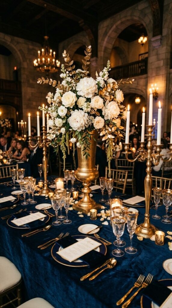
This is a palette for couples who want something regal, dramatic, and deeply rich. Navy and gold together read as formal and celebratory, which makes it an excellent choice for evening receptions and large-scale celebrations.
The combination works because navy is a neutral in the way that black is — it recedes and makes everything placed against it glow more intensely. Gold against navy looks genuinely opulent where gold against white can sometimes look brash.
Use navy linens — whether velvet, satin, or cotton — as your tablecloth base. Layer with gold charger plates, gold candleholders, and white florals as the primary blooms. The white of the flowers acts as a visual breath of air between the dark navy and the warm gold.
Budget tip: Gold spray paint is your friend with this palette. Plain terracotta pots, glass vases, and even fresh eucalyptus can all be lightly misted with gold spray paint to create cohesive gold accents without buying expensive gilded pieces.
For stationery, choose a deep navy card stock with gold foil lettering. The printing is more expensive than standard colour, but gold foil invitations on navy card create an unforgettable first impression.
Terracotta, Rust, and Warm White
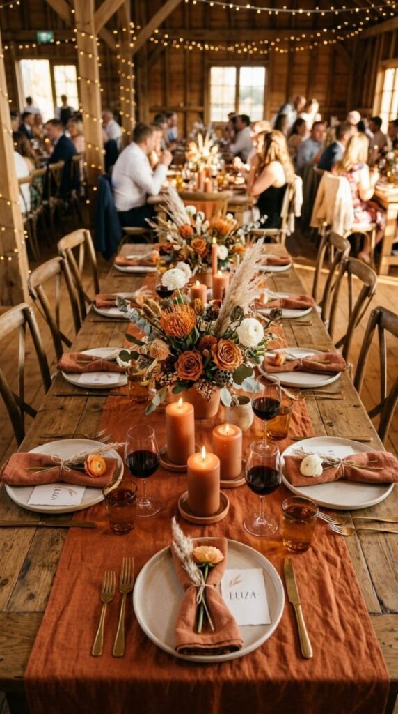
Terracotta became a defining wedding colour over the past few years and it shows no signs of fading. It is earthy, warm, and deeply photogenic. Its connection to natural clay, warm earth, and Mediterranean landscapes gives it an inherently romantic quality.
The palette works best when you allow a range of rust tones — from pale clay through to deep burnt sienna — to sit alongside each other. Add warm whites rather than cool whites: cream, ivory, and antique white all work better here than pure bright white.
For florals, orange protea, dried leucadendron, rust-toned chrysanthemums, and terracotta-hued dahlias in autumn are natural fits. Supplement with neutral dried grasses and white ranunculus or white cosmos for lightness.
Budget tip: Terracotta clay pots from garden centres make excellent low-cost centrepiece vessels. A 15cm pot costs less than £1. Fill with floral foam and arrange blooms in the top. Group three together at varying heights for a cohesive low centrepiece.
This palette is particularly strong in outdoor and rustic settings. Barn venues, vineyard receptions, and garden parties all suit these warm earth tones naturally. The palette also photographs exceptionally well in golden hour light.
Deep Burgundy and Forest Green
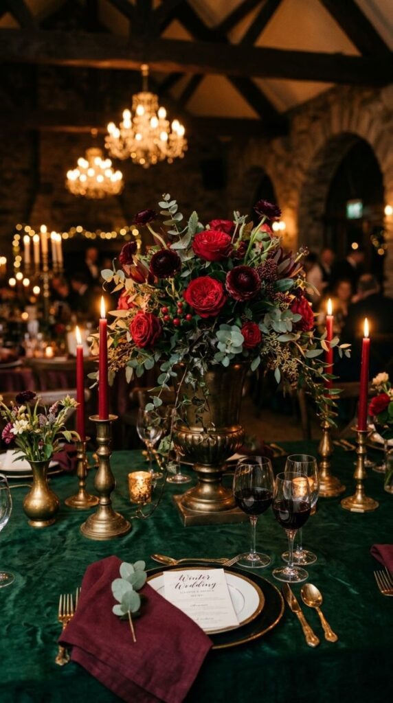
This is the palette for dramatic, moody, richly atmospheric winter or autumn weddings. Deep burgundy and forest green together look like something from a Romantic painting lush, textured, and full of depth.
The palette is built on two colours that are both dark and rich, so you need light to break them up. That light comes from candles — taper candles, pillar candles, votives. Candlelight interacts beautifully with dark tablecloths and deep-coloured florals.
For florals, use deep red garden roses, burgundy ranunculus, plum calla lilies, and dark foliage like dark ivy, black-tinted eucalyptus, and trailing smilax. These are autumn and winter staples at flower markets.
Budget tip: Trailing greenery — ivy, eucalyptus, and smilax — costs very little per metre and can be draped along table runners, across centrepieces, and over ceremony arches to create abundant botanical styling at a fraction of floral costs.
This palette suits stone churches, candlelit barns, grand hotel ballrooms, and any venue with dark wood, exposed brick, or Gothic architectural detail. It is one of the most visually striking winter wedding palettes available.
Soft Lavender and Silver
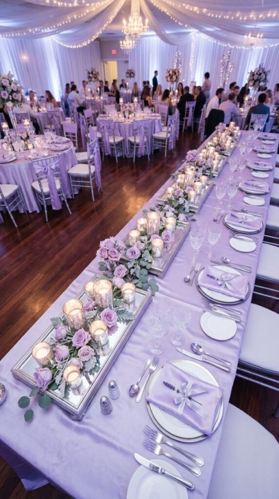
Lavender and silver feel like something out of a fairytale. This palette is airy, cool, and otherworldly in the best way. It suits evening receptions, winter weddings, and any couple who gravitates toward whimsy and romance.
Lavender reads differently across different materials — it can be warm and dusty in dried flowers, cool and fresh in satin fabric, and silvery in certain lights. Use that variability to your advantage. Layer lavender linen, lavender satin napkins, and fresh lilac roses together.
Silver details should be cool-toned rather than warm gold. Silver mirror trays as centrepiece bases, mercury glass votives, crystal glassware, and silver-toned flatware all contribute to the cohesive palette.
Budget tip: Mercury glass votives can be created at home using clear glass tea light holders and silver mirror spray paint. Apply lightly for an aged mercury effect. The project costs around £10–£15 in materials and yields dozens of votives.
For florals, pale lilac garden roses, wisteria (in season), lavender, and white sweet peas all fit naturally. Add silver dusty miller foliage — a grey-leafed plant available from most florists and garden centres — for a silver botanical accent that costs very little.
White and Eucalyptus Green (Monochromatic Botanical)
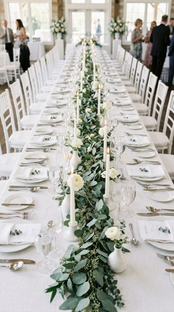
A monochromatic white and green palette is the cleanest, most editorial wedding look available. It never dates, it works in every venue, and it is genuinely affordable because the primary decorative element — eucalyptus — costs very little.
The key to this palette is confidence in the restraint. No other colours. No blush or cream trying to creep in. Pure white and eucalyptus green only. When you commit fully, the result is stunning.
Build your table around a eucalyptus garland running the full length of the table. A metre of eucalyptus costs around £2–£3 wholesale. For a 6-metre table you would need roughly 3–4 metres of garland to trail loosely.
Budget tip: Baby blue eucalyptus and silver dollar eucalyptus are the least expensive varieties and the most widely available. Buy in large bunches from a flower market and strip the lower leaves before laying along the table.
Small white bud vases with a single white bloom at intervals break up the garland without overshadowing it. The entire table design excluding crockery and glassware hire can cost as little as £20–£30 per table, making it one of the most affordable professional-looking table styles available.
Peach and Coral with Greenery
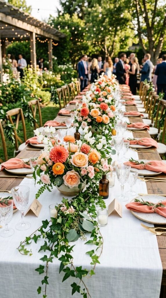
Peach and coral together feel immediately summery and joyful. This palette is for couples who want warmth, brightness, and life at their tables. It is the polar opposite of the muted, dusty palette trend — and sometimes that is exactly what a wedding calls for.
Peach and coral exist across a range of tones from pale sherbet through to vivid orange-pink. Work with what is naturally in season — garden roses in David Austin varieties like Darcey, coral dahlias, and peach-toned ranunculus are summer staples.
Greenery should be lush and dark — dark ivy, tropical leaves, and deep green ferns create the best contrast. Avoid pale or grey-green foliage here; you want the richness of a deep botanical green against the warmth of the corals.
Budget tip: Dahlias are among the most affordable summer wedding flowers. When in full season (July–September in the UK), a large bunch from a wholesale market costs around £4–£6 and yields many blooms. Grow your own from tubers for an even lower cost.
White linens work best as a backdrop to keep the focus on the florals. Avoid adding too many other decorative elements the flower colours are the show. Keep plates white, napkins white or green, and glassware clear.
Black and White with a Single Accent Colour
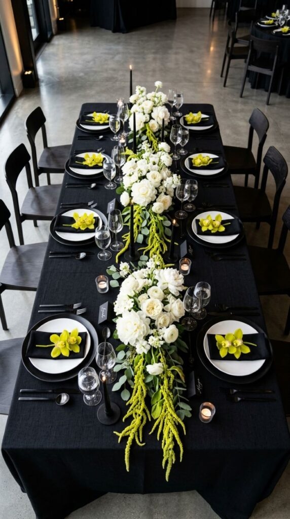
This approach choosing a black and white base and adding a single pop of saturated colour — is one of the most graphically striking strategies in wedding design. The contrast between the monochrome base and the accent colour is dramatic and very photogenic.
The accent colour can be anything: emerald green, vivid coral, electric blue, hot pink, or golden yellow. The rule is to use it in small, concentrated doses — a single bloom at each place, a band of colour on the napkin, or an accent in the centrepiece — so it reads as intentional rather than accidental.
This palette works best in contemporary venues: converted warehouses, modern hotels, rooftop spaces, and glass-fronted restaurants. It would feel out of place in a rustic barn or country manor.
Budget tip: If your accent colour is a single type of flower — like a vivid orchid or calla lily — you can source these from wholesale florists in uniform batches at lower cost than mixing multiple varieties. Uniformity can actually reduce cost.
Keep everything else in the setting rigorously black and white. Any warm cream or off-white creeping in will muddy the graphic clarity of the base palette. Use stark white plates, matte black linens, and chrome or black metallic accents.
Blush Pink and Rose Gold
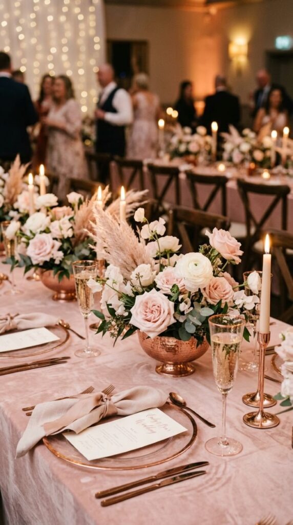
Blush pink and rose gold is one of the most consistently requested wedding palettes — and it earns its popularity. The warmth of rose gold metal against the softness of blush fabric and florals creates a result that feels genuinely luxurious without being cold or corporate.
The key distinction is between blush and baby pink. Blush leans warm and peachy; baby pink leans cool and bright. For this palette you want blush — the dustier, warmer version that sits comfortably beside rose gold tones.
For florals, David Austin roses in varieties like Juliet, Keira, or Patience are the natural choice. Add white ranunculus and dried blush pampas grass for texture and contrast. The dried elements also extend the arrangement’s lifespan if you are working with florals across a long day.
Budget tip: Rose gold metal spray paint transforms inexpensive plain metal vases, candle holders, and even terracotta pots instantly. A single can costs under £6 and covers many items. Combine with blush dried flowers for a high-end look at low cost.
For bridesmaids, blush chiffon or satin dresses are among the most flattering and widely available options across all price points. The colour suits warm and cool skin tones alike, making it a practical as well as beautiful choice.
Emerald Green and Cream
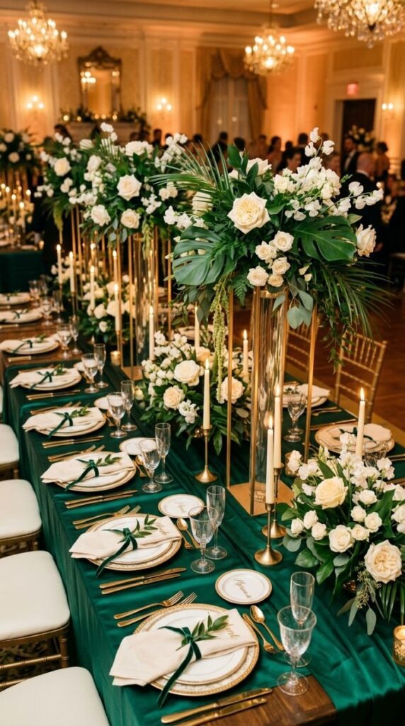
Emerald green is the jewel tone that never overwhelms when paired correctly. Against cream — warmer and more forgiving than pure white — it reads as lush, sophisticated, and full of life. This is a palette that works as beautifully in a grand hotel ballroom as it does in a garden marquee.
The success of this palette depends on committing to the depth of the emerald. A muted or sage green will not achieve the same effect. The richness of true emerald is what creates the contrast that makes cream florals glow.
For florals, cream or white garden roses, white lisianthus, white sweet peas, and cream ranunculus all work beautifully against dark emerald green foliage. Use tropical leaves, dark ivy, and glossy camellia leaves to build depth in the centrepieces.
Budget tip: Large tropical leaves — such as monstera, banana leaf, and palm — are available very cheaply from wholesale flower markets and add dramatic scale to floral arrangements at minimal cost. A single banana leaf can anchor an entire centrepiece.
For stationery, deep emerald card stock with cream or gold lettering is a striking and elegant combination. If foil printing is beyond budget, a cream ink on emerald produces an excellent result at standard print pricing.
Slate Blue and Copper
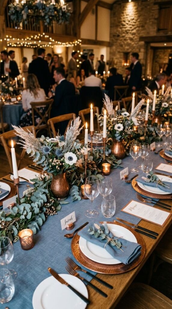
Slate blue and copper is a palette that does not appear on many mood boards — which is precisely what makes it worth considering. It is distinctive, contemporary, and deeply photogenic. The cool dusty blue against the warm orange-brown of copper creates a tension that keeps the eye engaged.
Slate blue is not navy and not sky blue. It sits in between — a grey-blue with a slight stone quality that photographs well in both natural and artificial light. Copper should be aged and warm rather than shiny and bright; a brighter copper can read as orange, which shifts the palette in an unintended direction.
For florals, use blue thistles, white anemones with dark centres, dusty miller foliage, and dried silver grass. Blue flowers are relatively rare in wedding florals, which makes this palette genuinely distinctive on the table.
Budget tip: Copper vessels and candle holders can be sourced from homeware discount stores and charity shops for a fraction of florist or event hire prices. Aged copper has more character than new copper anyway — a patina looks intentional and beautiful.
This palette suits industrial and contemporary venues particularly well. Exposed brick, concrete floors, and raw metal fixtures all complement the slate and copper combination without competing.
Mocha Brown and Warm Blush
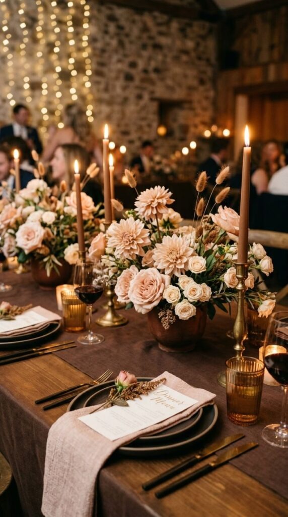
The café au lait dahlia changed wedding florals. This mid-brown, blush-toned dahlia — which sits somewhere between taupe, caramel, and dusty rose opened up a whole range of warm brown-based palettes that had previously felt too dull to work as wedding colours.
Mocha brown as a base is grounding and warm. It reads as earthy without the Mediterranean associations of terracotta. Against soft blush florals it creates a palette that feels like a warm autumn afternoon — intimate, comfortable, and genuinely beautiful.
For florals, café au lait dahlias are the anchor. Add blush garden roses, warm ivory spray roses, dried bunny tails in natural brown tones, and trailing dark caramel-coloured grasses. Avoid anything too cool or bright — this palette rewards warmth throughout.
Budget tip: Café au lait dahlias are highly seasonal — peak availability is August to October in the UK. Booking a late summer or autumn wedding significantly reduces the floral budget for this palette compared to importing out-of-season blooms.
For linen, a dark mocha brown tablecloth is not always available from every hire company. Cotton or linen fabric in this shade is widely available by the metre if you need to have tablecloths made at a lower cost than specialist event hire.
Lilac and Sage
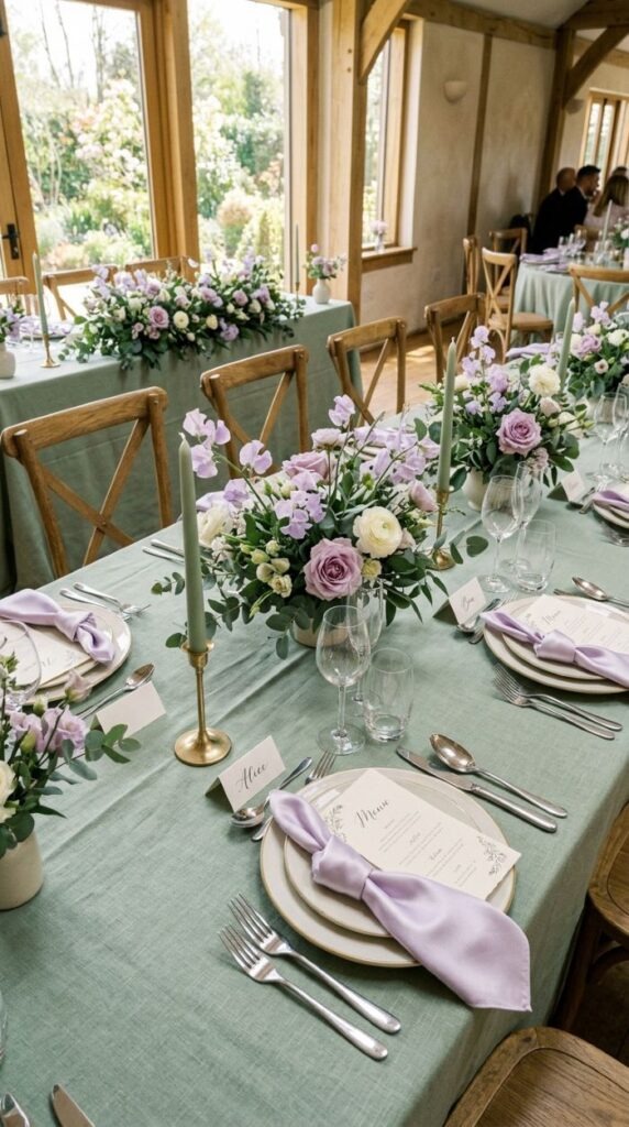
Lilac and sage together occupy a very specific colour register — soft, botanical, and quietly joyful. Neither colour shouts. Together they create a harmony that feels genuinely spring-like without becoming saccharine.
Both colours share the same muted, slightly grey undertone, which is why they work so well together. Lilac leans towards cool purple; sage leans towards grey-green. The overlap in their grey undertones creates a natural visual coherence.
For florals, lilac sweet peas are the ideal choice — they are light, delicate, and have a naturally wild quality that suits a loose, garden-style arrangement. Add pale lilac garden roses, white ranunculus, and fresh sage foliage. Wisteria works beautifully if your wedding falls in late spring.
Budget tip: Sweet peas are among the cheapest wedding flowers when in season (May–July). A large bunch from a wholesale market costs around £3–£4. Growing your own from seed from the previous autumn is even more economical and produces generous quantities.
This palette is ideally suited to outdoor ceremonies, orangeries, walled gardens, and any venue with large windows and natural light. The soft tones of lilac and sage both require good light to show their best — they can read as flat in dark or harsh artificial lighting.
Midnight Blue and Silver
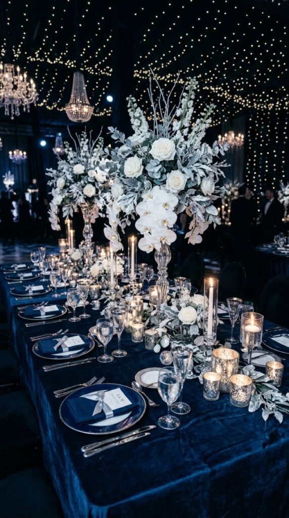
Where navy and gold reads as traditional and regal, midnight blue and silver reads as contemporary and celestial. The palette evokes a clear winter night dark sky, cold starlight, and the quiet drama that comes with it.
The depth of midnight blue closer to black than to navy means the silver accents shine very brightly against it. This palette rewards maximum sparkle: crystal glassware, silver mercury glass, metallic silver details in the centrepieces, and candles wherever possible.
For florals, keep blooms predominantly white and cool-toned. White garden roses, white orchid stems, white lisianthus, and silver dusty miller foliage all work. Spray fresh eucalyptus lightly with silver metallic spray to add botanical silver accents that feel organic rather than manufactured.
Budget tip: Pinpoint fairy lights in cool white rather than warm amber reinforce the midnight and silver palette beautifully. Fairy light hire is relatively affordable and the visual return — the sense of being inside a night sky — is disproportionately large.
This palette is best suited to evening-only receptions. It requires darkness and candlelight to read at its most dramatic. A daytime summer setting will flatten the contrast and lose the celestial quality that makes this palette exceptional.
Olive Green and Burnt Orange
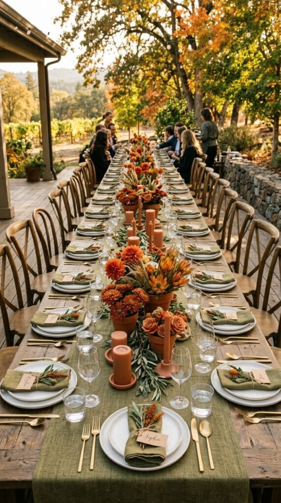
Olive green and burnt orange is the palette for couples who want something grounded, organic, and unmistakably autumnal. It references harvest season — overripe fruit, fallen leaves, sun-dried herbs — and has an immediate warmth that feels less curated and more genuinely natural than many wedding palettes.
Olive green is the muted, yellow-green tone found in sun-dried herbs, old canvas, and Mediterranean landscapes. Against burnt orange — which is a deep, dull orange rather than a bright one — it creates a palette that photographs with extraordinary richness in autumn golden light.
For florals, burnt orange dahlias and rust chrysanthemums are autumn staples. Add dried orange protea, leucadendron, and textured grasses. Fresh olive or rosemary branches introduce the olive green botanical element with an appealing informal quality.
Budget tip: Fresh herb branches — rosemary, olive, bay, and sage — are almost free compared to formal florist foliage. A rosemary bush in a garden or an inexpensive pot from a garden centre yields enough material to decorate multiple tables. The scent is also a beautiful bonus at a reception.
This palette is strongest in outdoor, barn, or vineyard settings. Avoid overly formal or contemporary venues — the palette’s earthy authenticity belongs in a setting that shares those values.
Mauve and Dusty Blue
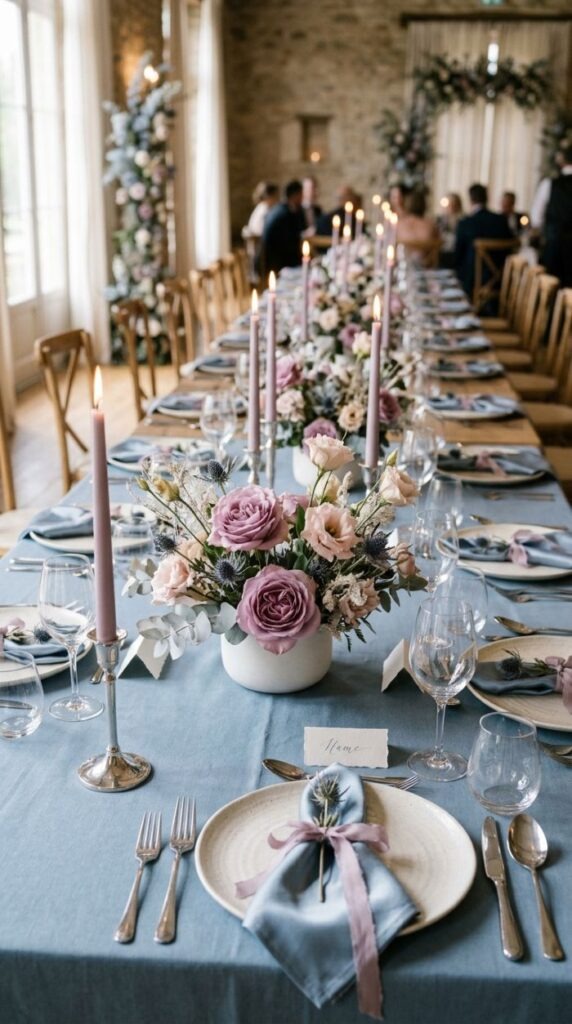
Mauve and dusty blue is one of the most underused combinations in wedding design, which is a genuine oversight. Both colours exist in the same muted, slightly greyish register — mauve is a faded purple-pink, dusty blue is a softened slate — and together they create a palette of considerable quiet elegance.
The palette works because the two colours share the same tonal quality: neither is saturated, neither is bright, and both have a slightly aged quality that feels romantic and considered. They are also genuinely flattering in photographs, particularly in natural light.
For florals, mauve roses, blush lisianthus, and dried blue thistles are the key elements. Pale blue delphinium — when in season — adds height and movement to tall centrepieces. Grey-blue eucalyptus varieties tie both colours together botanically.
Budget tip: Lisianthus is an excellent value wedding flower. It resembles a rose but costs significantly less. A bunch from a wholesale market yields many individual stems and is available across most of the year. In mauve and blush tones it is perfect for this palette.
For stationery, a dusty blue card with mauve ink and a botanical illustration motif creates a memorable invitation suite. Botanical line illustrations can be sourced from illustrators on freelance platforms at reasonable commission prices for a unique, non-generic design.
Champagne and Warm Gold (Monochromatic)
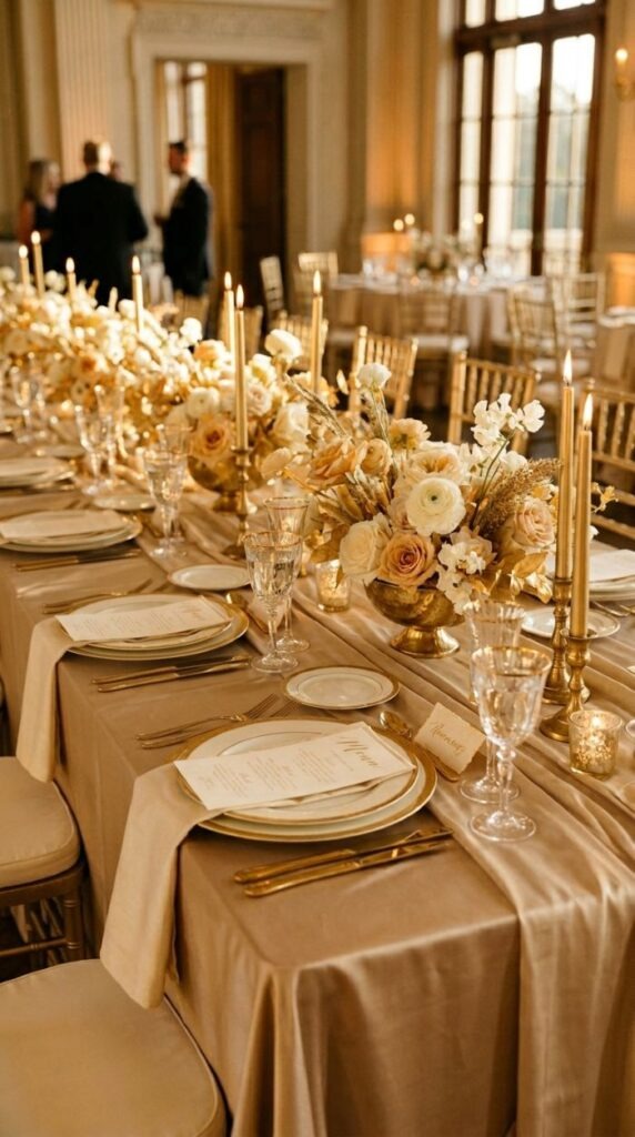
A monochromatic gold palette is one of the most quietly confident choices a couple can make. Rather than the contrast of two colours, everything exists in the same golden register champagne, ivory, cream, warm gold, and deep honey shifting in tone and texture but never in family.
The success of this palette is entirely dependent on variation in texture and material. Without contrast in tone, you create contrast in surface: matte linen against glossy satin, polished gold metal against the soft petals of ivory roses, the sparkle of glassware against the warmth of candlelight.
For florals, work exclusively in ivory, cream, and warm white tones. Champagne garden roses, ivory spray roses, white ranunculus, and pale cream lisianthus all belong here. Avoid any flower with a cool or grey-white tone — the palette requires the warmth to remain consistent throughout.
Budget tip: A single colour palette in the gold and champagne family can be achieved entirely through hire and tablecloth selection without any specialist purchases. Most event hire companies carry champagne or ivory satin tablecloths as a standard item they are among the most commonly hired colours and are priced accordingly.
This palette is extraordinarily versatile in venue terms. It suits grand ballrooms, intimate country houses, and outdoor marquees equally well because the warmth of gold is flattering in almost any lighting condition, from bright afternoon sun to deep evening candlelight.
Conclusion
Your colour palette is the thread that holds every visual element of your wedding together. When it works, nobody notices it they simply feel that the day was beautiful and cohesive. When it does not work, something feels slightly off even if guests cannot identify why. The good news is that any palette on this list can work beautifully with the right execution. The secret is commitment. Pick a direction, stay consistent across your flowers, linen, stationery, and styling, and resist the temptation to add too many colors once you have chosen. Two or three colors used with confidence will always look more polished than five colors used hesitantly. Go back through the palettes that caught your eye, hold them up against your venue, your season, and your instincts and trust what you see. The right palette for your wedding is simply the one that feels most like the two of you.